
Tutorify
Educational Website Design
About Tutorify
Tutorify is a two-way educational platform that allows students and tutors to be introduced to each other online or in person.
So, tutors can apply to teach on this platform, and students can use it to take educational classes.
The classes are offered in groups or privately, covering textbook topics from middle school to university.
This project runs on two tasks: the app version and the web version.
In this case study, I want to book an online private class on the web version.

Project Overview
The business needs to simplify the process of booking training classes to make it easier for users to connect with tutors. These classes can be held online or in person, either in groups or privately.
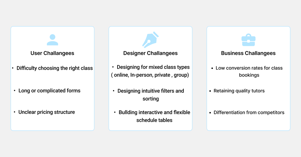
Challenges
A successful user experience starts with a deep understanding of the pain points. This project explored challenges from the viewpoints of users, designers, and the business to ensure the solution was comprehensive and impactful.
Design Goals
Business Need
Target Users
Our target users are classified into several segments, this case study focuses on students.


Students from middle school to university.
For adults of any age who need to learn subjects such as languages or other topic.
Tutors who have registered their information on the website as tutors.
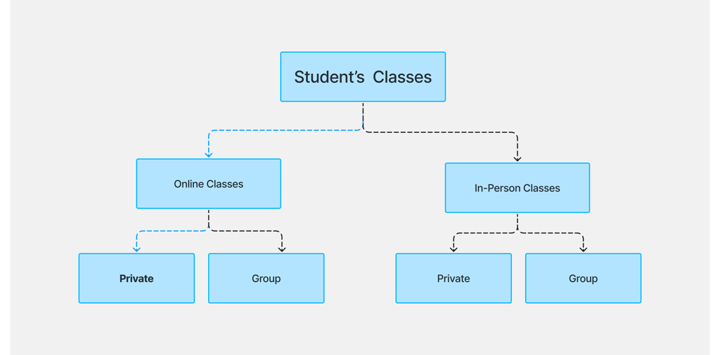
On this platform, students can hold classes with tutors in four different ways. Our target users are private online classes, the blue dashed line indicates our path.
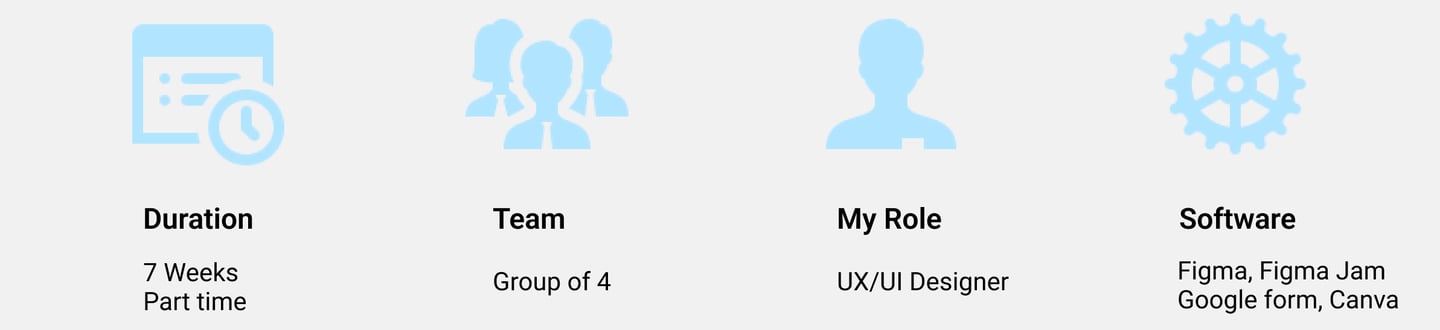
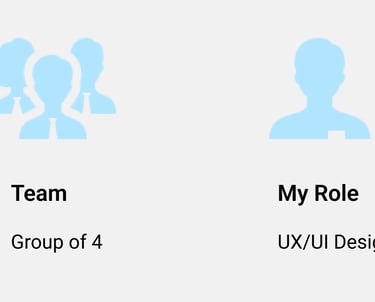
I was one of the UX/UI designers. I was involved throughout the entire process, starting from conceptualization to creation of the prototype.
My Contribution
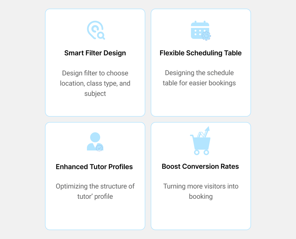
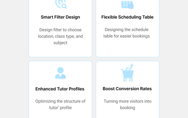
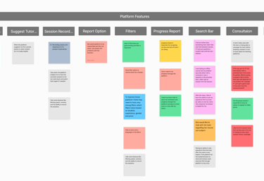
Among the various design goals, four areas were prioritized for their direct impact on the user experience: intuitive filtering, optimized tutor profiles, flexible scheduling, and improved conversion rates. These focus areas guided the core UX decisions throughout the project.
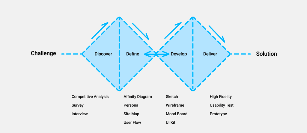
Design Process
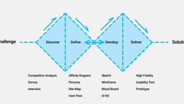
Discover
Competitive Analysis
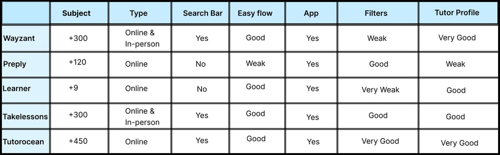
To understand the successful patterns of similar platforms, we conducted a competitive analysis. Initially, we analyzed 12 similar educational platforms to better understand their structure and functionality.
Then we shortlisted 5 of them for a more detailed review because they were closer to our business goals, and according to the reviews of users, we realized that compared to other platforms, they provided a more user-friendly and efficient user experience.
Takeaways
The analysis aimed to achieve two key objectives: drawing inspiration from the information architecture and its classifications and examining the flows and pathways within the platform's design. Ultimately, valuable insights were gained from the search bars, filters, teacher profiles, user flows, and design steps.
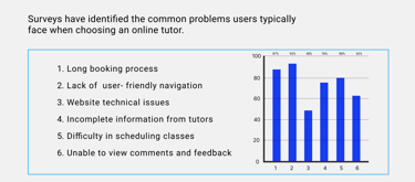
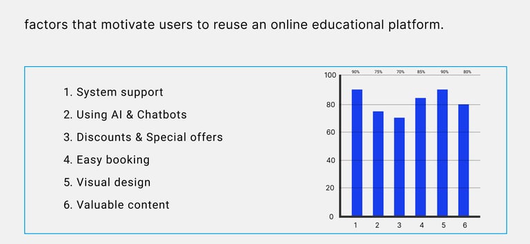
Survey
To deepen our understanding of user preferences when choosing an online tutor, we conducted a cross-age survey and gathered insights from 65 respondents. Below are some key findings.
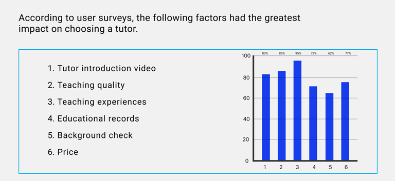
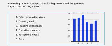
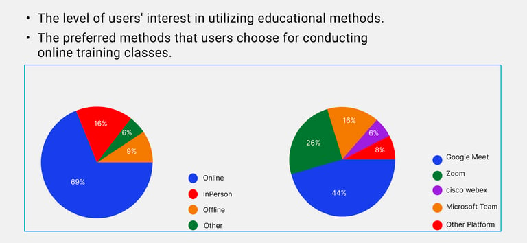
Takeaways
By examining the surveys, we were able to identify the users' priorities and concerns in finding tutors. However, we needed to interview some users to gain a deeper understanding of the issue.
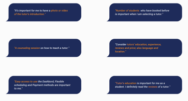
Interview
12 individuals from different age groups were interviewed as part of the survey, providing valuable insights. Below are some quotes from the interviews.
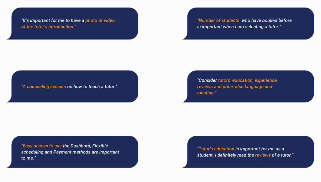
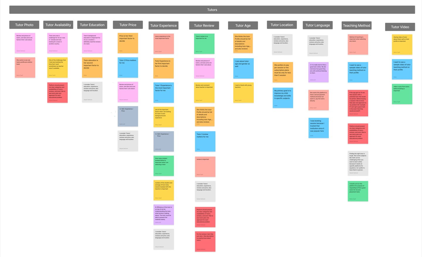
In creating the affinity diagram, we identified the most important factors to consider.
Affinity Diagram
Takeaway
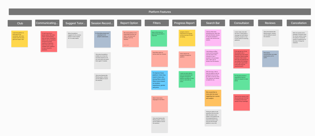
Based on the available tasks, sticky notes were categorized into two subgroups: tutors and the platform.
Some of the user needs were identified through competitive analysis, while others emerged from interviews and affinity diagramming. A persona will then be created using the insights gathered.
Tutor Experience
Tutor review
Teaching Method
Filtering
Searching bar
Consultation session
Define
The Insights gathered from surveys and interviews led to the development of this persona. The primary goal is to highlight recurring patterns and pain points, enabling a deeper understanding and empathy toward users.
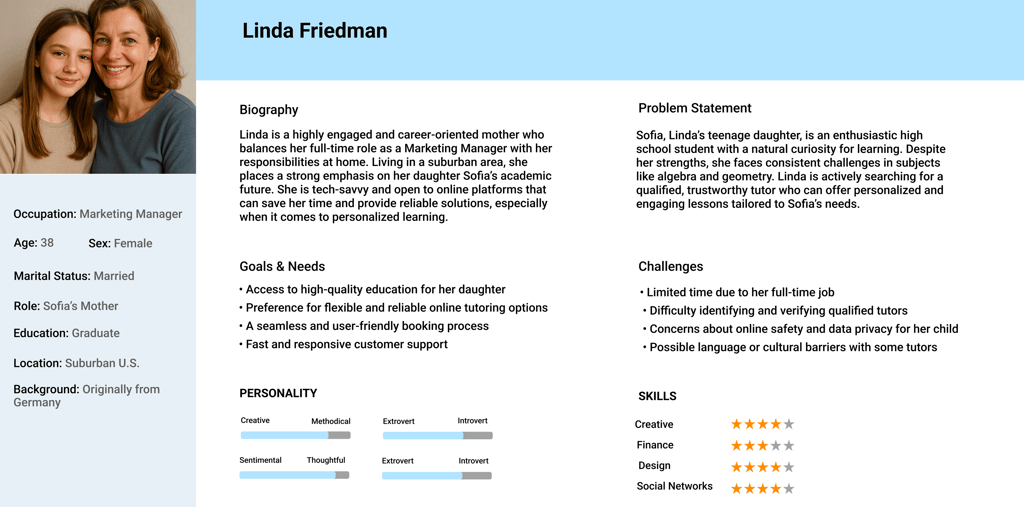
Persona
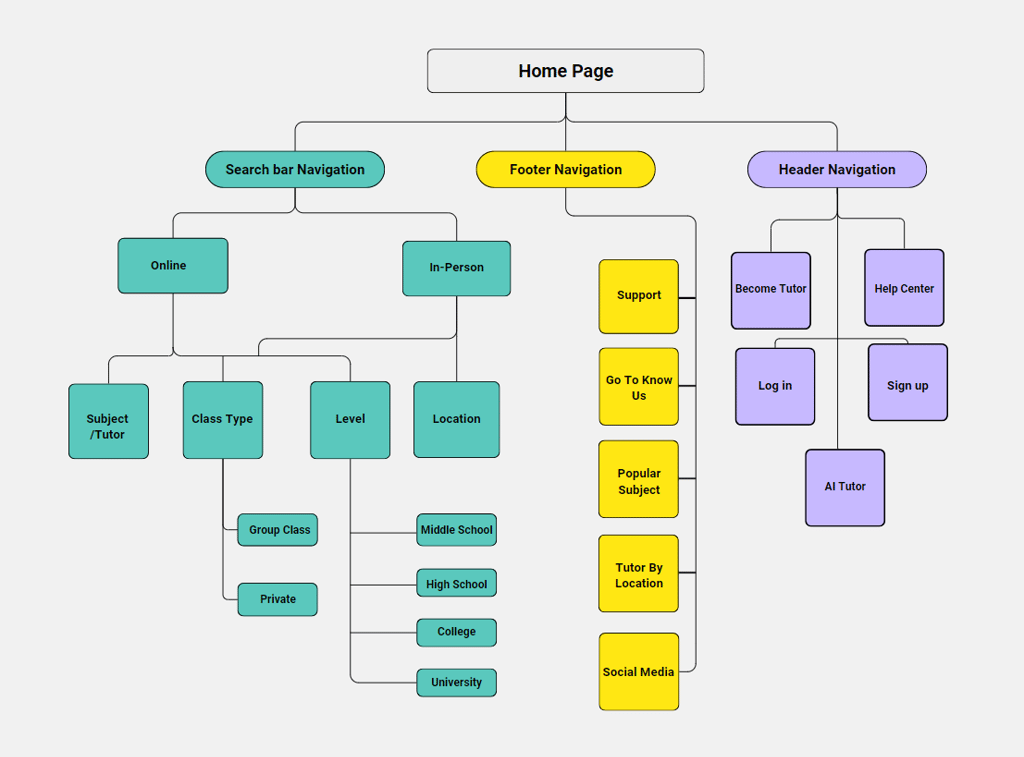
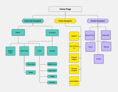
Site Map
The sitemap was designed based on the collected information and users’ needs, aiming to illustrate the overall structure and architecture for a clearer understanding of the hierarchy.
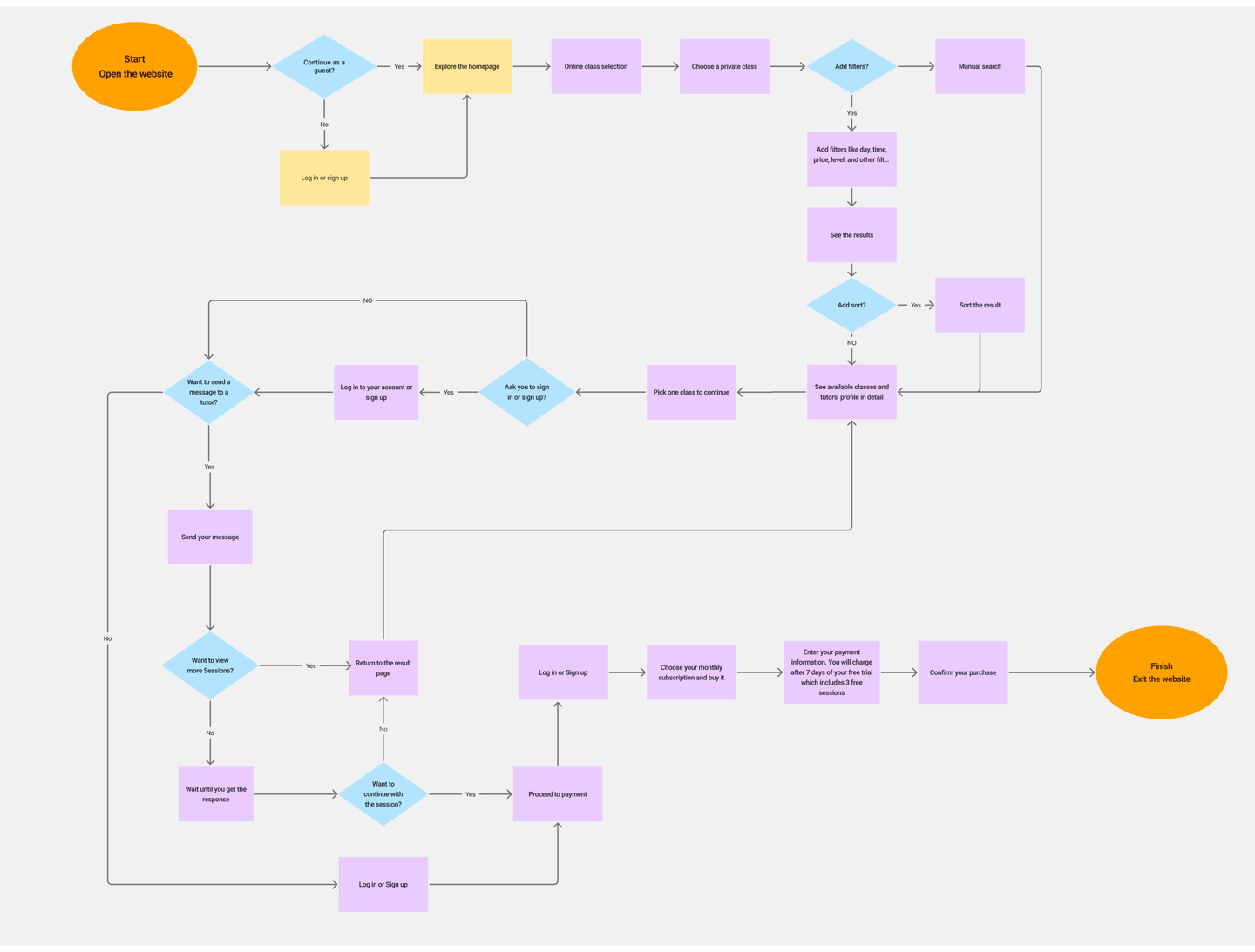
User Flow
The goal of designing the user flow is to enhance the user experience and clarify the navigation path for individuals looking to choose a private online class.
Develop
Exploring various ideas and solutions
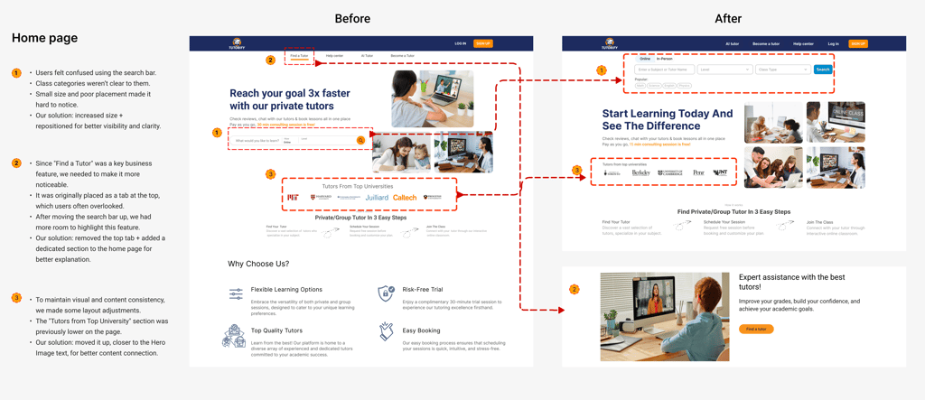
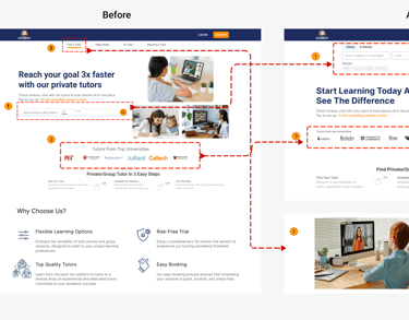
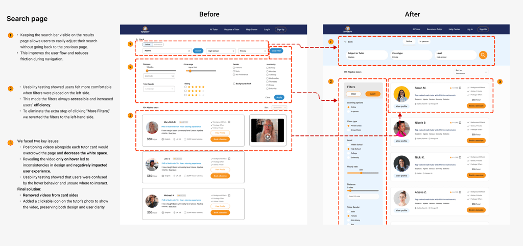
A complicated and confusing teacher search experience
Finding the right teacher based on user needs was time-consuming and complex.
The available filters weren’t effective enough, and many users felt overwhelmed during the search process, which negatively impacted the overall user experience.
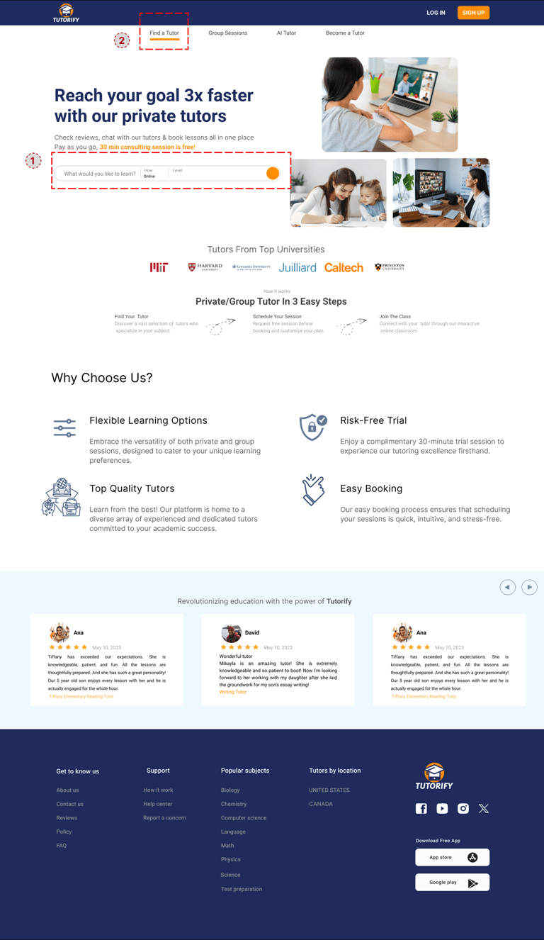
2. A flow that guides the user to the search page, allowing them to seamlessly continue the process of finding a tutor.
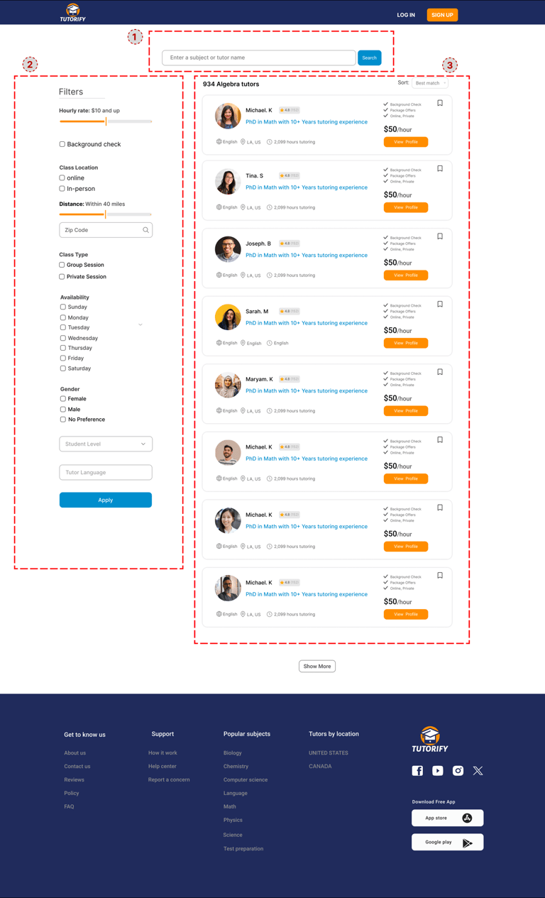
1. An advanced search bar that clearly distinguishes between available class styles (online/in-person) from the start. The drop-down enhances user convenience and speeds up the process of finding tutors.
1. The search bar remains accessible, allowing users to modify their search at any time without restarting the process.
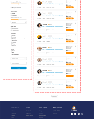
2. Among various design iterations, implementing a sticky vertical filter that clearly presents all key factors for tutor selection proved to be highly effective.
3.Through a streamlined design, users can easily select a tutor directly from the cards while also accessing profiles and additional information with minimal effort.
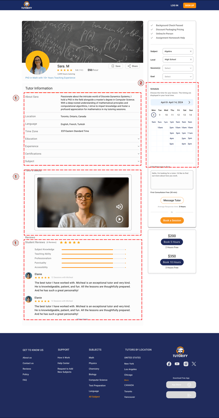
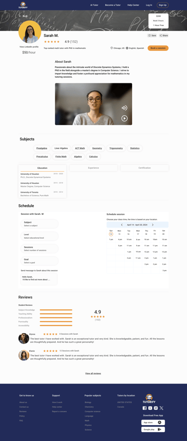
Lack of trust in tutor profiles
Users—especially parents—needed to feel confident before booking a class. However, the existing tutor profiles lacked sufficient information and didn’t provide enough insight into the tutor's background.
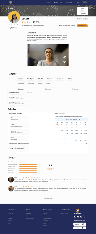
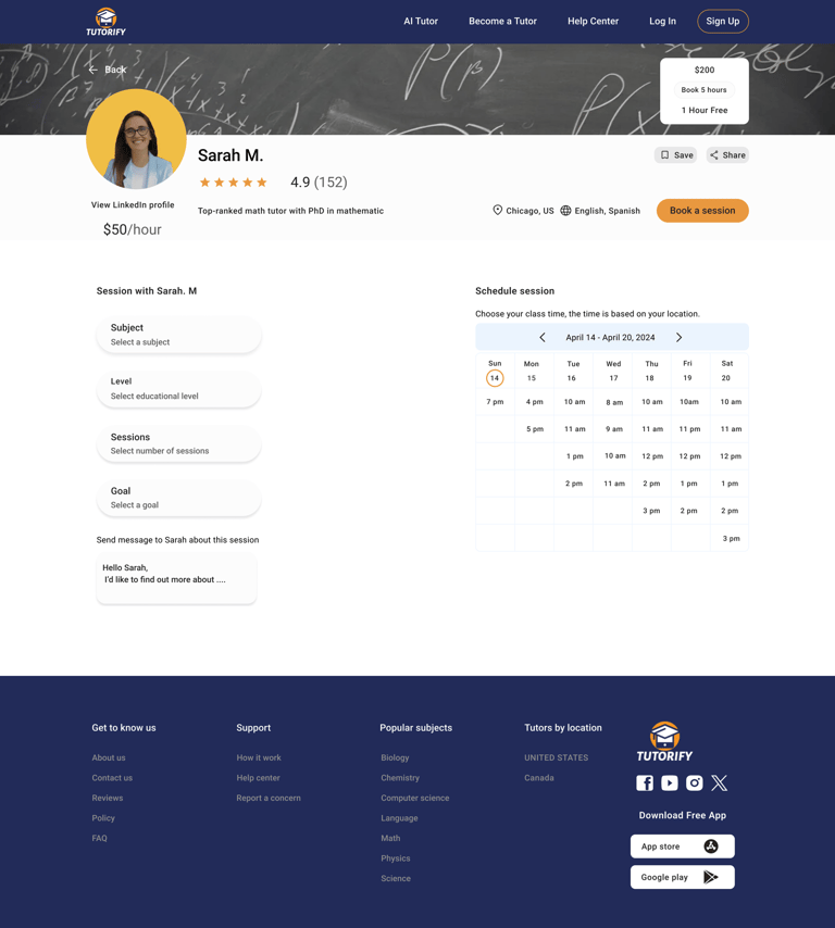
Complexity in the booking flow due to unclear availability and disjointed steps.
Users often struggled to understand when tutors were available, which made the booking process confusing and slowed down decision-making.
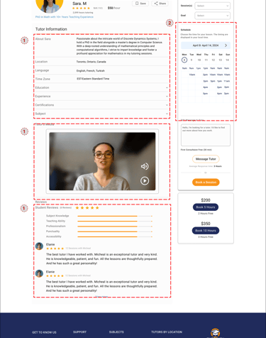
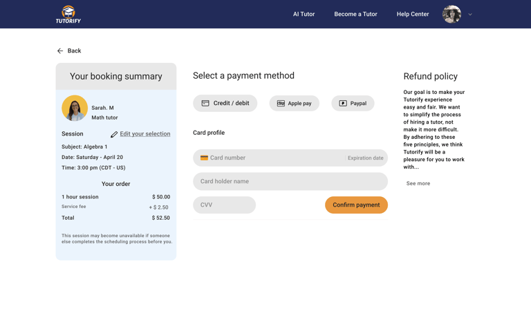
2 .Displaying the tutor’s available time slots alongside class details, combined with a clear CTA button that smoothly redirects users to the payment page. This streamlined the flow and improved booking completion rates.
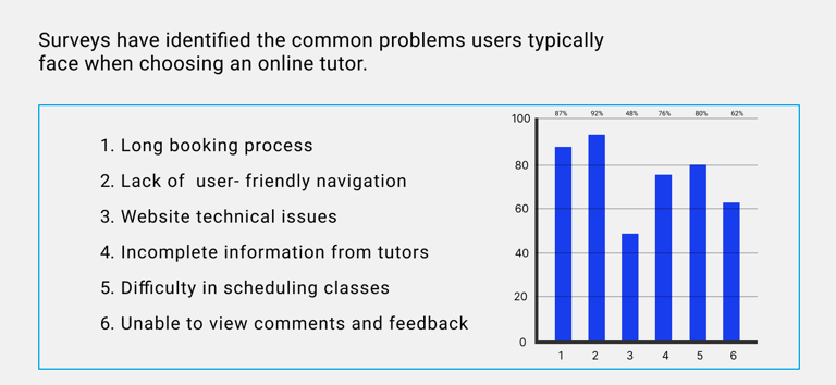
User research and the insights gained helped us map out the user journey and clearly identify the core challenges.
We want to show some of the initial challenges.
1
2
3
Low user awareness of class formats and the need for diverse teacher discovery methods
Many users were unaware of the different class formats available (online, in-person).
Additionally, due to the platform’s wide range of users with varying needs and preferences, it was essential to offer multiple ways to search and discover suitable teachers, enabling a more personalized experience.
Solutions
Challenges
Challenges
Solutions
Challenges
1 .Redesigned tutor profiles to include an introduction video, teaching experience, verified credentials, reviews from previous students, and a trust badge for verified tutors.
Solutions
Takeaway
At this stage, initial design concepts will be developed, and through design techniques, usability testing, and focused iterations, the path toward the final design will be effectively shaped.
My teammates and I tried to map out our ideas so that we could communicate better. Finally, the sketches were formed in 4 pages.
Sketches
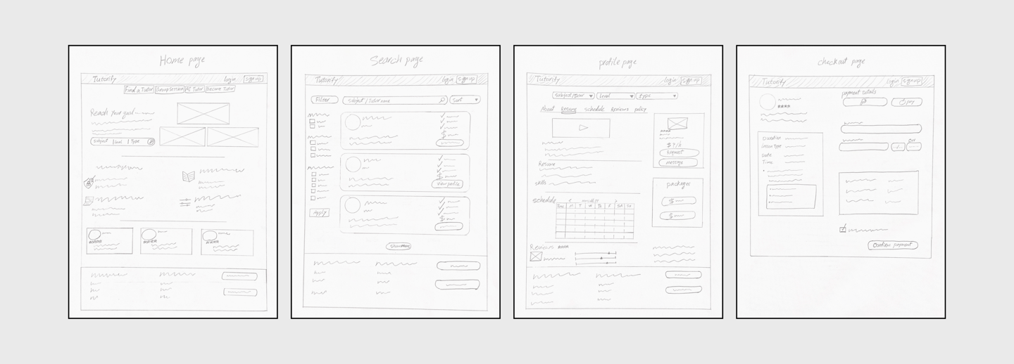
Home page
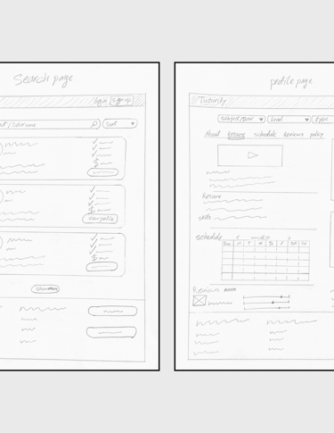
Search page
Profile page
payment page
Mid-Fidelity Wireframe
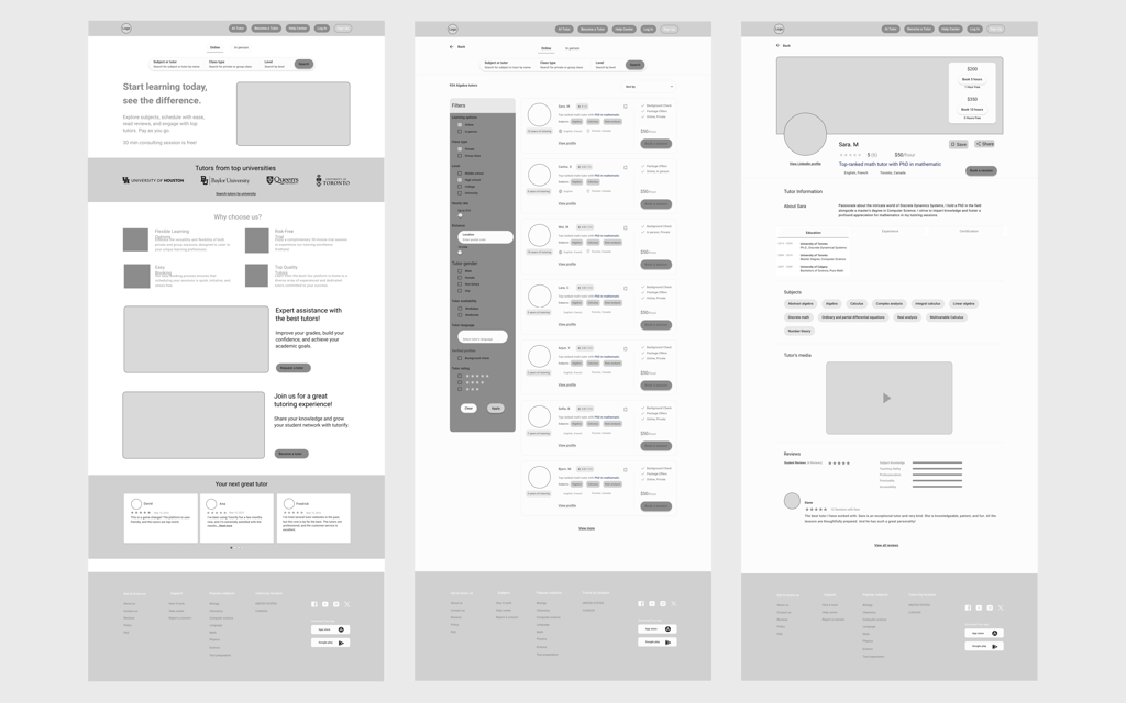
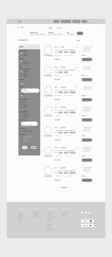
After several iterations, our wireframe was drawn like this.
Home page
Profile page
Scheduled page
Search page
Payment page
Login page
Mood board
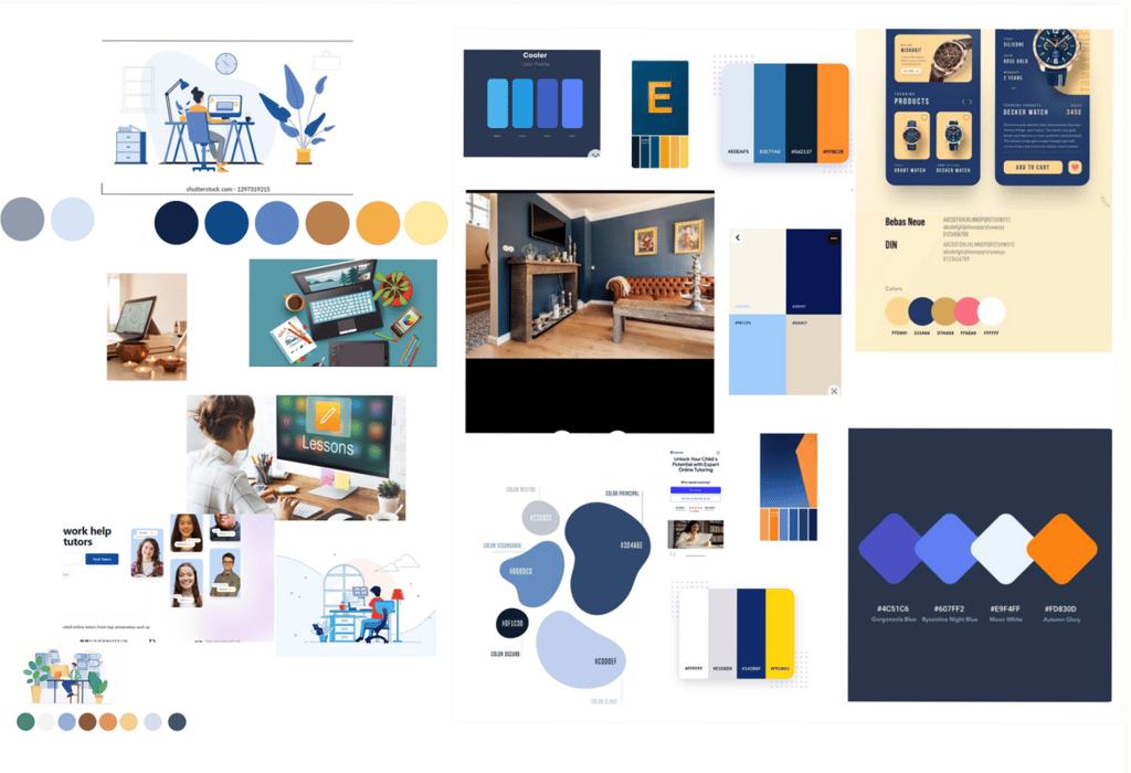
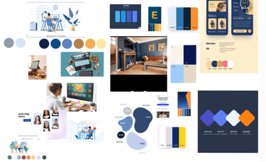
Images, colors, and textures were gathered to support the design process. Inspired by these elements, the team refined its ideas and enhanced creativity. The mood board played a significant role in selecting the color palette, establishing the visual roadmap, and guiding the overall design direction.
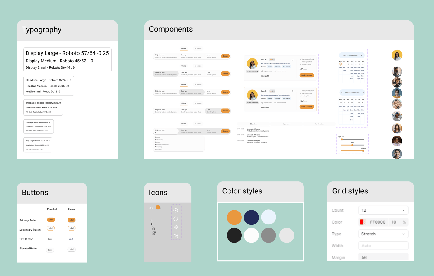
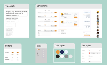
UI Kit
To serve as a comprehensive reference, a UI kit was created for patterns and components, ensuring the design remains efficient, consistent, and cohesive throughout the project.
Deliver
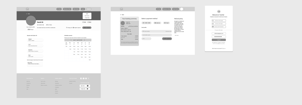
High-Fidelity Wireframe
After many iterations, our final wireframe was drawn like this.
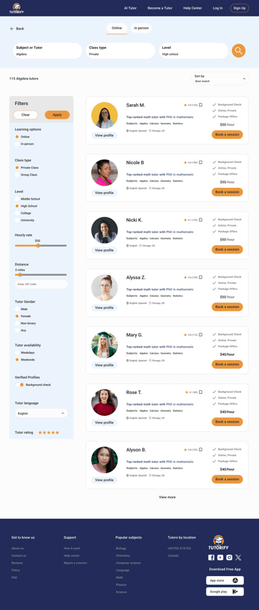
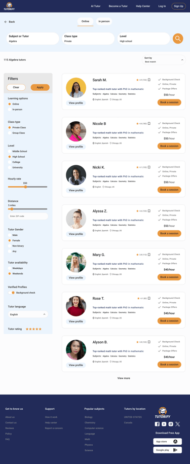

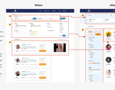
Search page
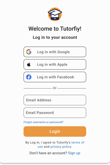
Login page
Schedule page
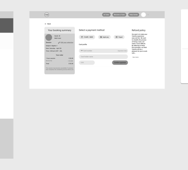
Payment page
Profile page
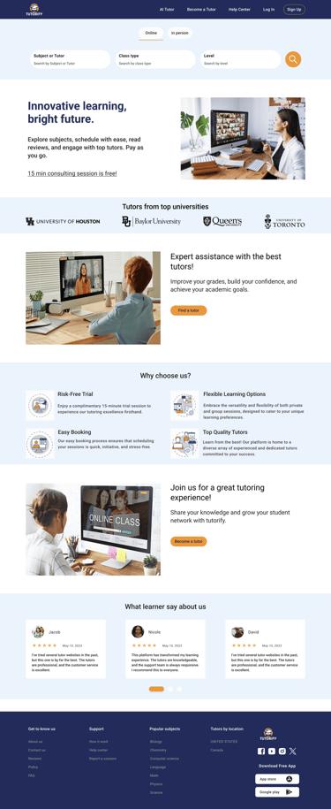
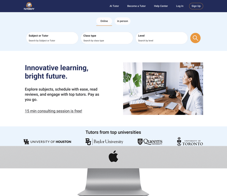
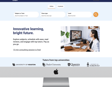
Home page
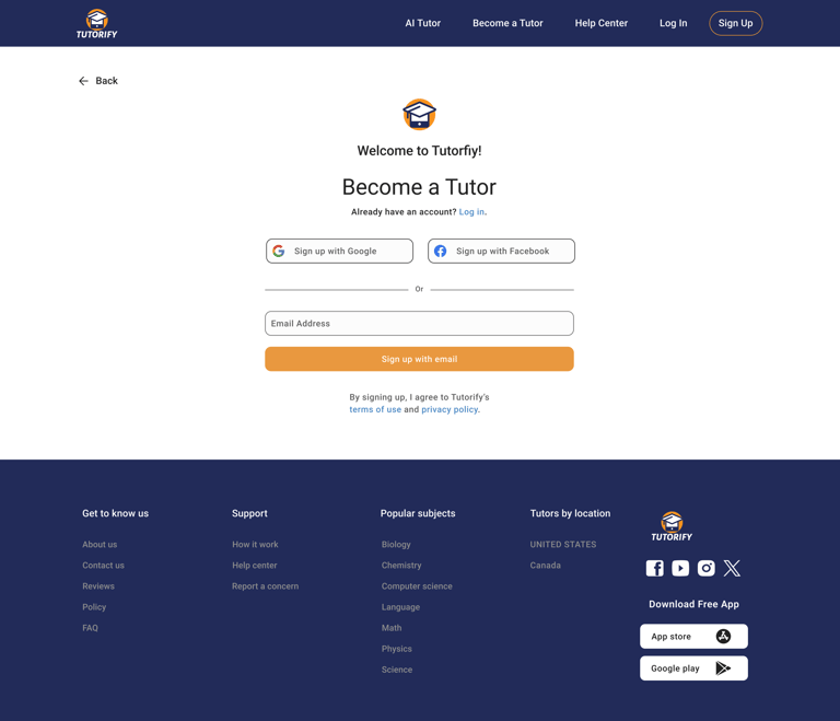
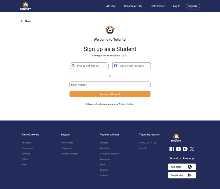
Sign up
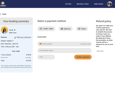
Payment page
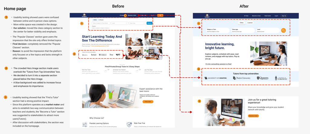
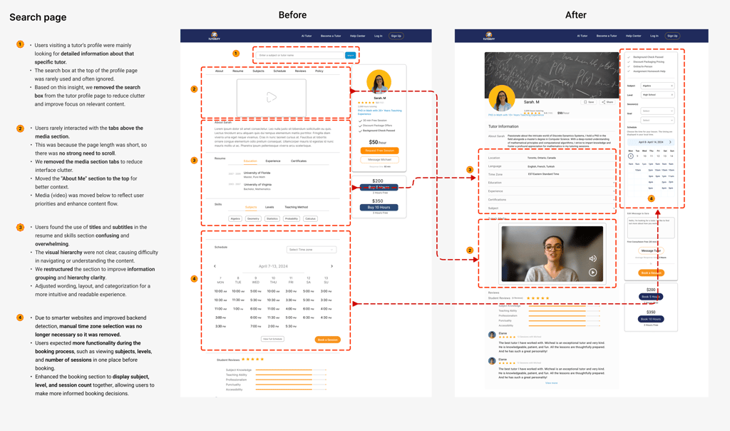
Usability Test & Iteration
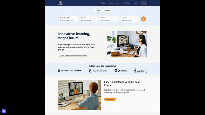
Prototype
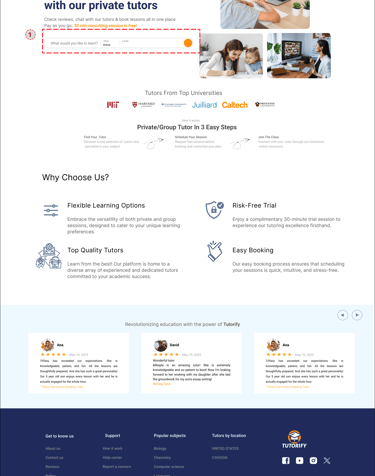
Here is the last prototype, displaying what we've achieved through our design process.
Throughout the project, we went through multiple iterations, driven by the insights we gained from usability tests. These tests were instrumental in shaping our decisions and constantly enhancing our project.
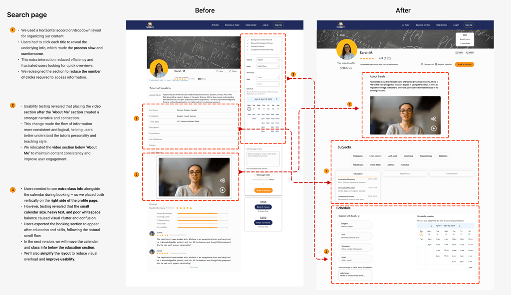
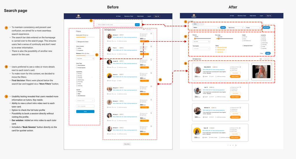
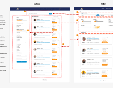
Version 1
Version 2
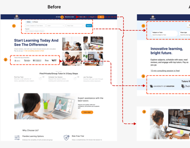
Home page
Search page
Version 2
Version 1
Profile page
Version 2
Version 1
Reflections
What I have learned
The critical role of user research in designing intuitive and effective solutions.
Collaborating with cross-functional teams to align on vision and ensure timely project delivery.
Iterative testing and feedback loops significantly enhanced usability and user satisfaction.
Creating a UI kit to maintain design consistency and streamline team communication.
Next Steps
Finalize the mobile version of the design to ensure seamless adaptability across devices.
Conduct further usability testing and iterations to refine the user flow and enhance the overall user experience.